How to vote:
- Choose your favourite design concept
- Reply below with your top 2 choices
- Add any additional critiques or changes you'd like to see along with your choices
What to think about when voting:
- These are First Drafts and are not finalised. We can change icons, colours, fonts, etc. You're choosing your favourite concept.
- Take into consideration the various sizes and uses each logo will be scaled to utilise (Discord channel avatar, website favicon, server banners, social media backdrops, etc)
- It is not required to be able to gather the communities entire history just from looking at the logo. We'd like a good representation of what we do, but the 'brand' will self-identify with the people part of the community anyway(like the multi-coloured ball that means Google Chrome, or Apple's...ummm...apple logo)
Here they are:
DemiCata Controller Logo
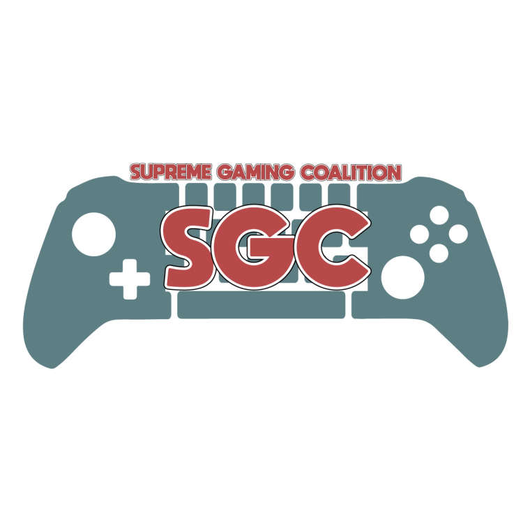
Crypt MouseShield Logo
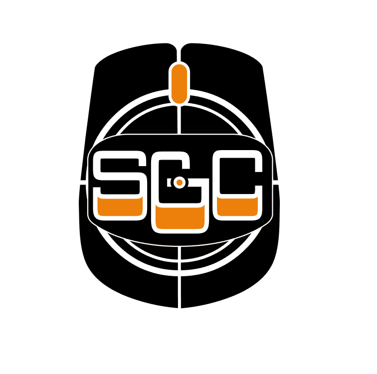
CataDemi Keyboard Logo
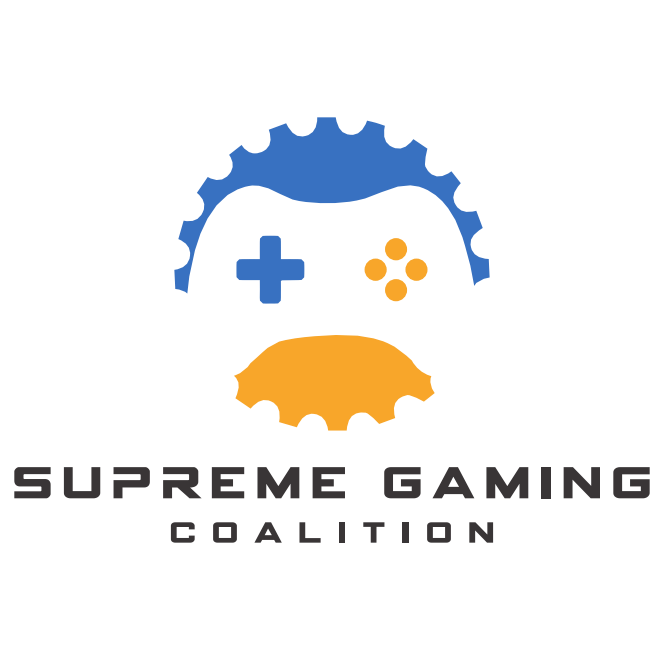
Jester Gear Logo
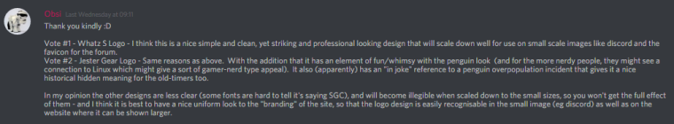
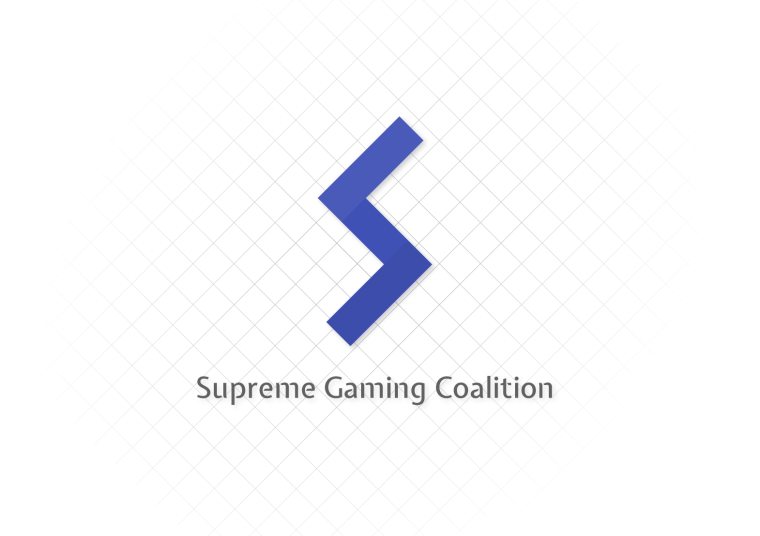
Whatz S Logo
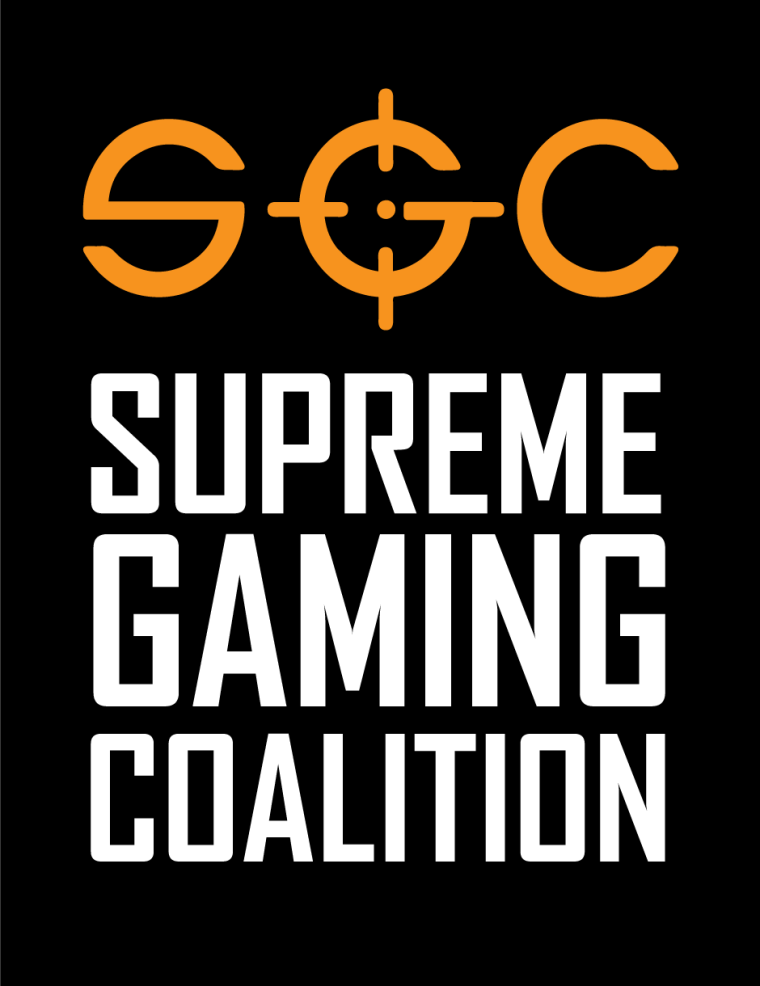
Zac Crosshair Logo
Please remember that these can all be modified. Colours, fonts, icons, etc are not finalised.
Thanks for your support!

 , my votes are:

") Zac Crosshair Logo
Zac Crosshair Logo