Community Logo Design Poll

How to vote:

  1. Choose your favourite design concept
  2. Reply below with your top 2 choices
  3. Add any additional critiques or changes you'd like to see along with your choices

What to think about when voting:

  1. These are First Drafts and are not finalised. We can change icons, colours, fonts, etc. You're choosing your favourite concept.
  2. Take into consideration the various sizes and uses each logo will be scaled to utilise (Discord channel avatar, website favicon, server banners, social media backdrops, etc)
  3. It is not required to be able to gather the communities entire history just from looking at the logo. We'd like a good representation of what we do, but the 'brand' will self-identify with the people part of the community anyway(like the multi-coloured ball that means Google Chrome, or Apple's...ummm...apple logo)

Here they are:


DemiCata Controller Logo
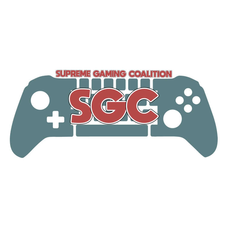
0_1529429306768_Cata_Demi_logo.jpg

Crypt MouseShield Logo
0_1529429336628_crypt_logo.png

CataDemi Keyboard Logo
0_1529429351912_Demi_Cata_Logo.jpg

Jester Gear Logo
0_1529429366179_JesterGear.PNG

Whatz S Logo
0_1529429380879_Whatz_Logo.png

Zac Crosshair Logo
0_1529429401626_Zac_Logo.png

Please remember that these can all be modified. Colours, fonts, icons, etc are not finalised.

Thanks for your support!

A Fool thinks himself wise, but a wise man knows himself to be a fool.

Choices:

  1. Jester Gear Logo
  2. Whatz S Logo

Critique:
I really like the fonts in both the gear logo and S logo so I'm not sure which one I like better. For the S logo I'd also use the gold secondary colour somewhere (maybe the font or something similar).

A Fool thinks himself wise, but a wise man knows himself to be a fool.

  1. DemiCata Logo
  2. Crypt Mouse Shield

I like the way these two point out that were a gaming community. The only thing i would change would be to make it more bold colors on the DemiCata one, and maybe change the font on the crypt one to make it more easier on the eyes.

Jester Gear Logo
CataDemi Keyboard Logo

  1. Jester gear
  2. Crypt mouse
  1. Jester Gear Logo
  2. Whatz S Logo

Being visually impaired I look for things that pop out at me which means colors are important. I also like simple in detail that is not to confusing and things that won't get lost in all the different usages.
What I see is that black/gold seem to pop, but these logos i would remember. The face (Gears) as well as the S.
Vision is important to me so looking at something that doesn't hurt my eyes, that pops and is easily seen and speaks to me telling what I am looking at is extremely important. Good luck all of you!

  1. Crypt's
  2. Jester's
  1. Crypt's
  2. Whatz's S logo
  1. Whatz
  2. Jester
  1. Jester Gear Logo
  2. Whatz S Logo
  1. Whatz S logo
  2. Jester Gear Logo
    Critique: i agree with Jester on Whatz' logo, a gold "S" behind the blue one would make a great accent.

Since we can apparently vote for our own designs, and I'm totally not biased 😄 , my votes are:

  1. Whatz's S Logo
  2. Jester's Gear Logo

The voting is still open, as of this message, but I would like to extend a huge thanks to everyone who took the time to participate. My criticism for all other logos is the lack of simplicity. Some of they would work amazingly in large format, however a logo will be used in website header with a maximum height of around 50-60px, discord channel icon, bot icons, etc. At that height, for logos with text it becomes near illegible and the details and lines mesh together to make a "blob". Perhaps the fault lays with us for not providing use-case guidelines.

With that said, my logos votes are not without criticism.

  1. S Logo. While simple, leaning towards generic, and it might be too simple and not establish a strong identity. There is some playful shadowing and subtle color breaks for added depth. The "S" shape lends it self to the "S" in Supreme. It functions as a letter and a brand identity. My initial goal was to add some beveling across the shape to identify more closely as a Tetris shape. In this way, the "S" would still be clear and further detail would accentuate the "gaming" aspect, retro and modern at the same time. I didn't get to it in V1 but definitely something to work on for V2 if the time comes.

  2. Gear logo. Again, perhaps too generic. The controller is an obvious allusion to gaming but my concern is that it relates too closely to an XBOX controller and we do not host nor plan to host console servers. It may send the wrong message as to what TYPE of gaming community we are. The argument can be made that PC players can play on controllers, but that's definitely a minority. Secondly, the gear. I can't really marry the shape with anything that we are related to. We don't do anything mechanical and it seems the gear is just fluff to distract from the generic controller. Then, the tiny details such as buttons and d-pad will be lost in header and icon formats. In addition, the gear teeth will not render properly in small sizes and particularly low resolutions. It will display as a very rough and fuzzy circle.

DemiCata Controller Logo
Whatz S Logo

Jester's logo
Zac's. 😛

  1. Crypt MouseShield Logo

  2. Jester Gear Logo

Alternate b/c I like to pick 3 not 2 🙂 Zac Crosshair Logo

0_1529930132545_f1ccdbb6-b196-4c54-ab14-30ad95a6639e-image.png

A Fool thinks himself wise, but a wise man knows himself to be a fool.

Thank you all for voting, the two logos we'll be moving forward with will be:

Gear Logo - 12 votes
S Logo - 9 votes

All logo submitters will still be receiving 'Backer' status as a show of thanks for their hard work and contribution to the community!

A Fool thinks himself wise, but a wise man knows himself to be a fool.

Locked

Looks like your connection to Supreme Gaming Forums was lost, please wait while we try to reconnect.